
Introduction
After the relaunch of the Aspect brand, Aspect’s focus shifted to launching a new workforce management product. Looking at the existing Workforce Enterprise product, it was clear that there were some large gaps both from a visual perspective but also on the user experience side of things. Seemingly simple tasks like requesting time off or viewing your schedule were not straightforward, and required a lot of extra steps to complete—often requiring the use of multiple different screens to compare and confirm information.
The below case study (while still a work in progress) details some of the challenges and process of redesigning the existing product, including the creation of a stronger information architecture, design language, and components.
Drag and Drop Scheduling & Split Activities
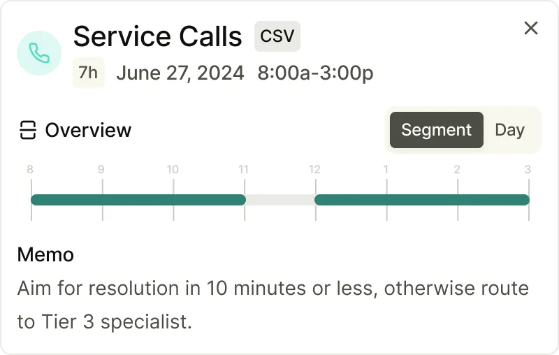
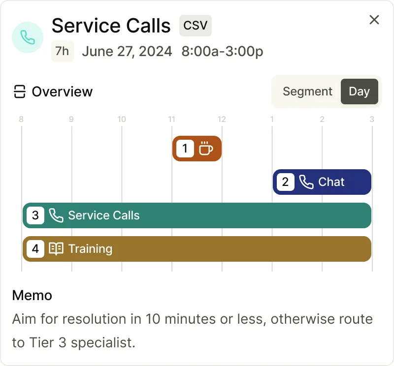
While seemingly simple, the process of dragging and dropping activities to modify a schedule is not trivial. With the complex ways that call centers operate, there are a variety of different rules that can impact how activities can be scheduled. Similarly, a displayed schedule may only represent the top level of one’s schedule, with additional activities hidden below their primary (displayed) activity with the intent of providing the agent with a ranking of prioritization of activities.
In order to design around these complexities, we needed to provide an interface that would allow for the agent to understand the impact of their actions, while also providing a clear visual representation of their schedule. After exploring a few different options, we landed on a design that showcased the layering of activities, potentially surfacing any splits in activities that may not be immediately obvious.


Availability Layering
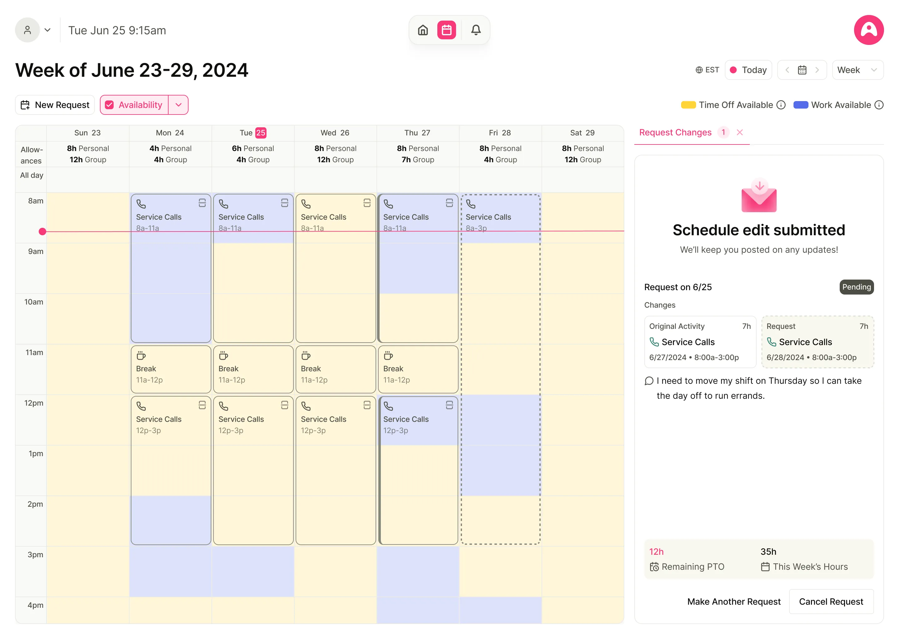
In addition to complexities around drag and drop scheduling, another frequently cited point of frustration was around the ability to gain insight as to what times were in need of additional staffing (overtime) or there was an overage in staffing (time off). By surfacing this information on the schedule, we hoped to provide additional insight for the agent to use when making decisions around their schedule (picking up overtime, requesting time off, etc). Unfortunately, the availability layering is not as simple as toggling a layer onto the schedule, but rather requires an understanding of the different types of balances/accounts that can be used to cover changes in capacity, thus requiring the need for a dropdown to control which staffing group and accounts to fetch availability from.
Approval Predictions
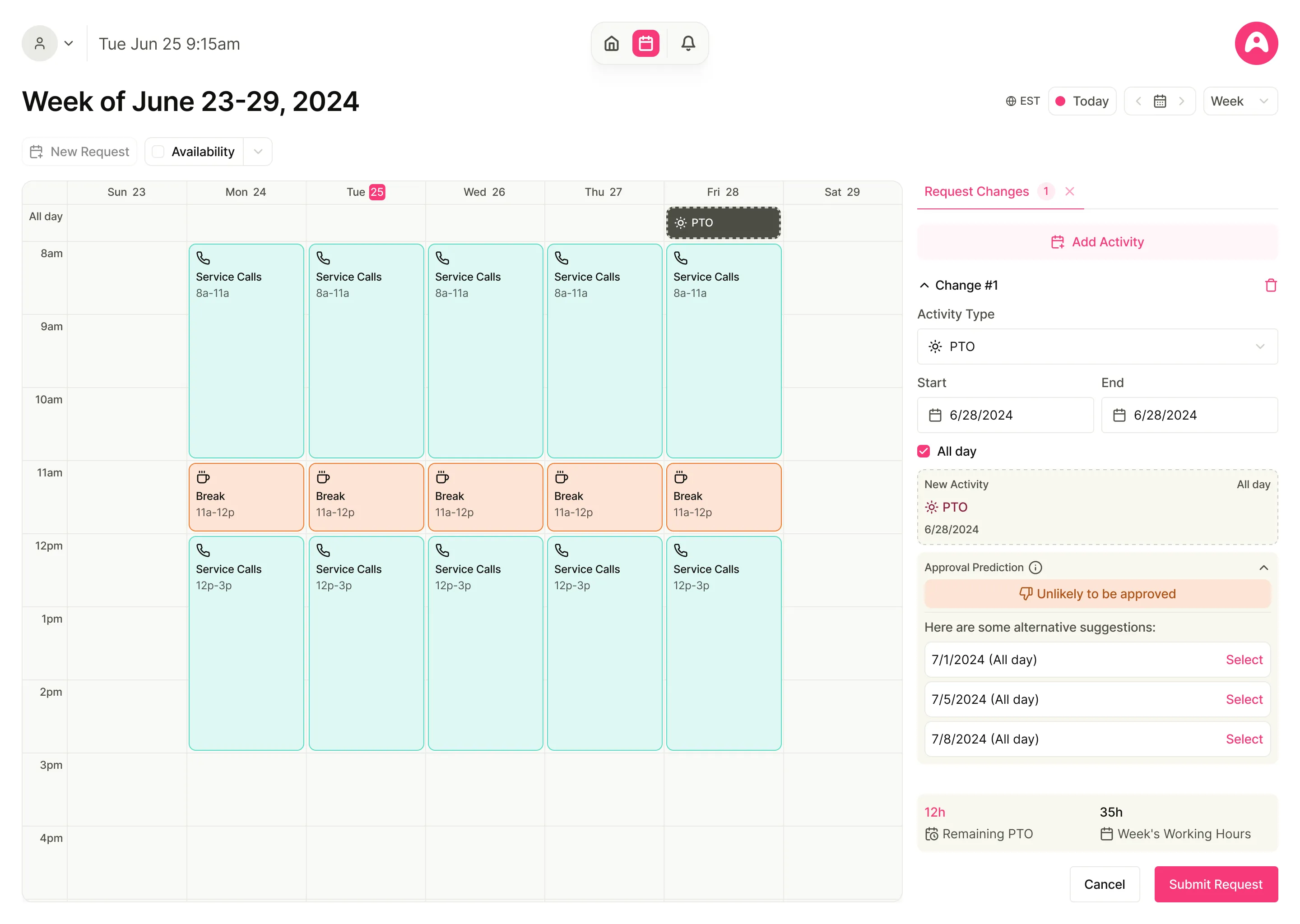
With so many rules and complexities around how activities can be scheduled, it was important to provide visibility into the likelihood for a given schedule edit to be approved. By surfacing approval predictions, we hoped to provide an indication to the agent on how it may be approved as well as provide alternative suggestions in the case of low approval likelihood so as to not end in a dead-end UX flow.
This case study is still a work in progress, and will be updated with additional details and design challenges as the project progresses.